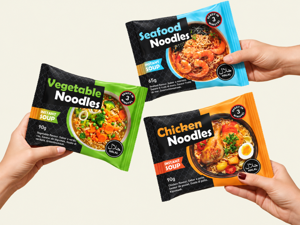
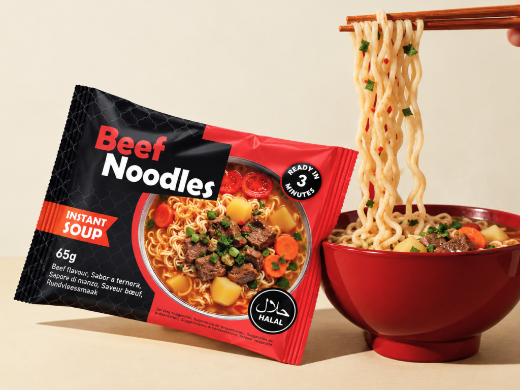
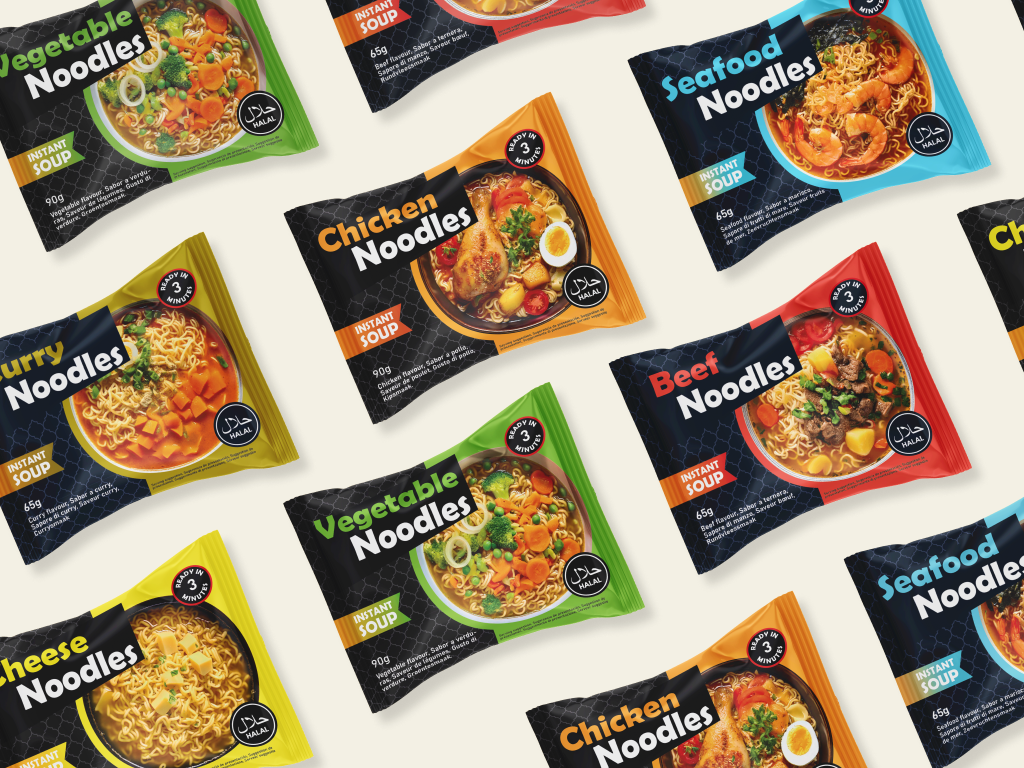
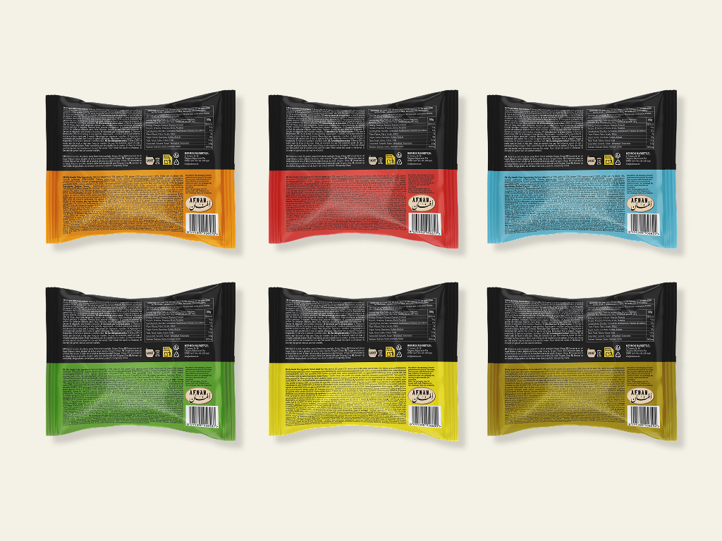
This project involves the packaging design for a noodle brand, developing a collection of six different designs for six flavours. The client's challenge was to position the product with a more premium aesthetic, setting it apart from most noodle brands found in supermarkets, which often rely on a very cluttered look and highly traditional graphic references. The proposal embraces a cleaner, more modern and elegant visual language, in which each variety is distinguished by its own specific colour. The front of the pack features a clear image of the product for each flavour, making it instantly recognisable to consumers.
Family Noodle
Each day, a new flavour to discover.
- Any:
- 2026
- Categoria:
- Packaging
This project involves the packaging design for a noodle brand, developing a collection of six different designs for six flavours. The client's challenge was to position the product with a more premium aesthetic, setting it apart from most noodle brands found in supermarkets, which often rely on a very cluttered look and highly traditional graphic references. The proposal embraces a cleaner, more modern and elegant visual language, in which each variety is distinguished by its own specific colour. The front of the pack features a clear image of the product for each flavour, making it instantly recognisable to consumers.